


Collaborative Science, Technology and Applied Research Program
A Stony Brook University and the National Weather Service Collaboration
How To Navigate this the CSTAR Ensemble Sensitivity Website
Below, a two-step process is outlined towards efficiently using the CSTAR Ensemble Sensitivity Analysis website.
In these instructions, we use the NCEP ensemble. However, each page for each ensemble (i.e. for CMC, NCEP+CMC, ECMWF) has a similar layout. Therefore, understanding how to use the NCEP analyses will be transferable to the entire site.
Case studies will also be provided in the near future to complement the directions and to help provide an understanding of and guide through the ensemble sensitivity data.
Step 1: Understanding the Layout of the Site
On each page on this site, there are four distinct areas that will allow for efficient navigation through this site, pictured below.
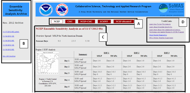 |
A. Top Ensemble Navigation allows the user to jump from one ensemble to another quickly. The ensemble that is currently being used is highlighted in white, which in this example is the NCEP ensemble as can be seen in the figure. The default ensemble when entering the site from the CSTAR home page is NCEP.
B. Sidebar Archive Navigation allows the user to view previous run’s Ensemble Sensitivity Analyses. Generally, this sidebar will provide access to analyses for a few months. Analyses not available in this sidebar can be requested.
C. Ensemble Sensitivity Analysis provides the data and plots for the Ensemble Sensitivity Analysis. This section will be discussed in greater detail below.
D. Useful Links Section provides links to how to use the site, case studies, and other websites that may be helpful or of interest to those viewing this analysis.
Step 2: Understanding the Ensemble Sensitivity Analysis (Section C in the above)
For each ensemble, there is 1. An Overview MSLP /Spread Section. and 2. Ensemble Sensitivity by Regions .
In the Overview MLSP/Spread Section, the site (Fig. 2) displays the ensemble mean MSLP and spread over North America for an 8 day forecast. This provides an overview of where there are large variations in ensemble members in the short- and medium-term time frame. This section can be overlooked if the user already has a specific date / region of interest.
The Ensemble Sensitivity Sections by Regions is where the bulk of the analysis lies. This section is separated into regions, two of which are static (Regions 1 and 2) and one of which floats to different areas of interest in the North American domain (Region 3). Note, not all ensembles are available for all regions. Also, each region's analysis is organized in the same manner.
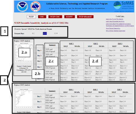 |
In Figure 2, it can be seen that each region's analysis has four main components:
2.a. Region Image and Location displays a map and the coordinates of the region
2.b. Forecast Days. Depending on when the weather event of interest is, the forecast day is chosen. For example, if there is a major east coast storm expected 3 to 4 days from the current time period, we would first check the analyses associated with the Day 3 or Day 4 forecast as the focus the analysis
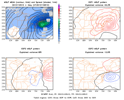
2.c. Summary EOFs and MSLP/Spread. The figures in this column represent the most prevalent patterns, which are known as EOFs (Empirical Orthogonal Functions), between the SLP of the ensemble members. The summary EOF and MSLP/Spread figure displays the three most prevalent SLP patterns and the percentage of the variance in the ensemble members that can be explained by that specific pattern. Generally, these patterns will be associated with either the amplitude or a position uncertainty in the weather system of interest. The figure below demonstrates a sample Summary EOF image.
 |
2.d. EOF Analysis. From the Summary EOFs and MSLP/Spread figure (Fig. 3), the three most prevalent patterns in SLP are shown. Each of these EOF patterns are then projected onto each ensemble member, which allows for a sensitivity analysis that can evaluate the relationship between the evolution of the EOF pattern and the initial state variables, such as current SLP and 500 hPa heights. In this section of the site, plots are provided that trace back the sensitivity in the evolution of the EOF pattern to the current time period. Analysis for how these EOF patterns are correlated to SLP or 500 hPa heights are both available and present in separate columns for each EOF. Because these plots are stepped back in 12 hour increments, two or even three figures may be necessary to trace back the Forecast Day EOF pattern to the current time. The below figure displays an example of this process of tracing back the senstivity. More information about interpreting these plots can be found here .
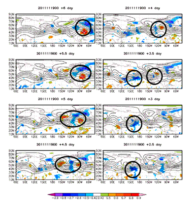 |
In the Ensemble Sensitivity Evolution plots such as Figure 4, the cold and warm colors represent sensitivities to the initial state variables. These shaded regions often can be traced back to the initial time period. In this specific figure, the circled regions illustrate how the EOF sensitive region associated with an extratropical cyclone off the U.S. East Coast originated over the western Pacific early in the forecast. More information about interpreting these plots can be found here .